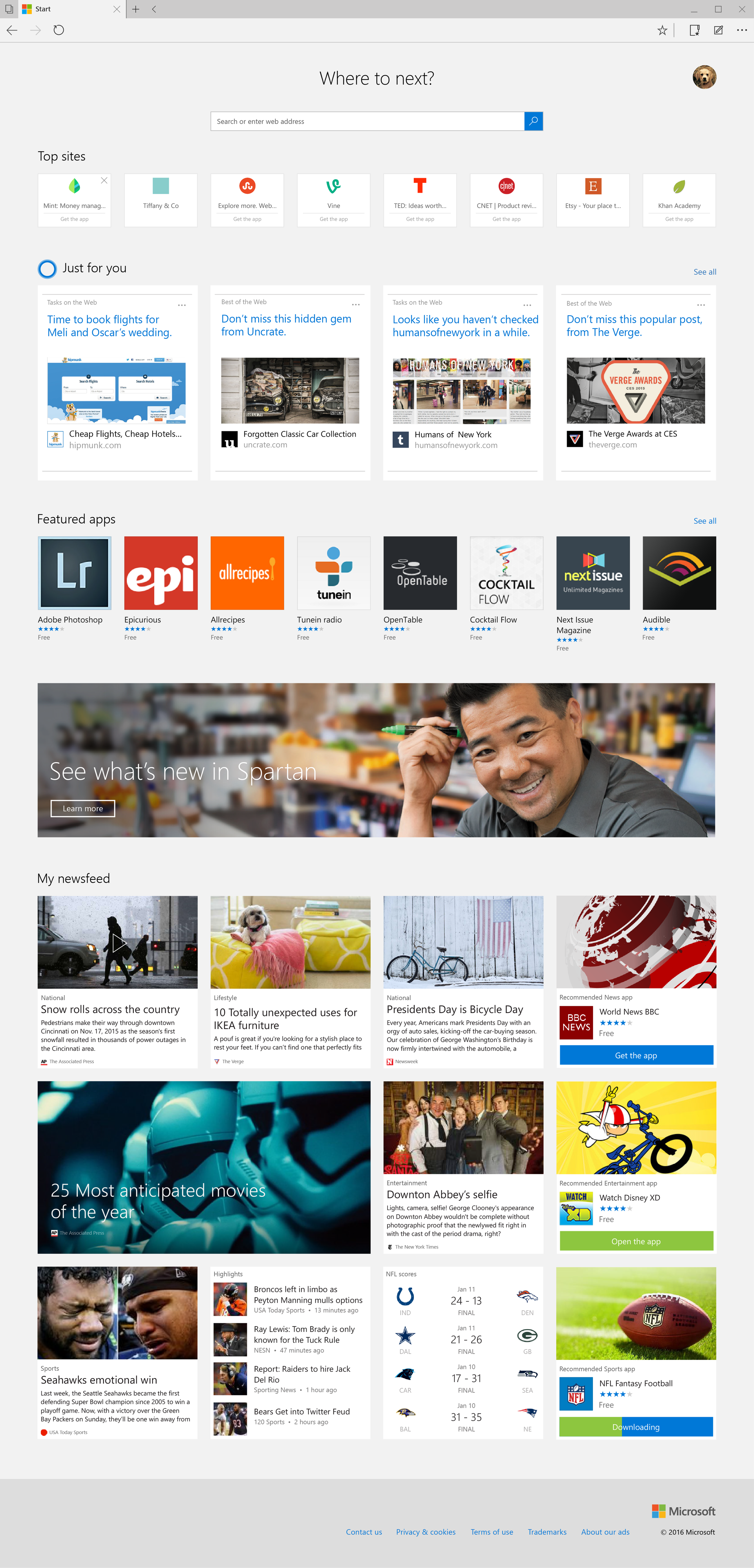
microsoft Edge Homepage
When Windows 10 was first released in Spring 2015, the Edge browser was also shipped and ready to use. Since Windows 10 was a free upgrade for existing Windows 8 users, and Edge was the new and powerful default browser, having an equally new and powerful browser homepage presented a great opportunity to engage more users in new ways.
OPPORTUNITY
Users can discover Microsoft Store content on the new Edge browser. Edge can attract and retain more customers and generate new revenue promoting the Microsoft Store and app ecosystem, as well as other Microsoft content.
QUESTION
How can we provide a new, engaging experience that would attract more users to our Store and Services?
CONCEPT
Create a valuable and unique experience on Microsoft Edge that people would want to use regularly.
USER CONSIDERATIONS
1 This page may be the first point of entry for new customers and new products.
2 As this space was not traditionally used for advertising, we must be considerate of our usage of promotional content.
3 Monetize the Edge Default Homepage in a thoughtful, easy to use design.
(Please click to see the full Edge Homepage)
Card system neatly stacks for easy viewing
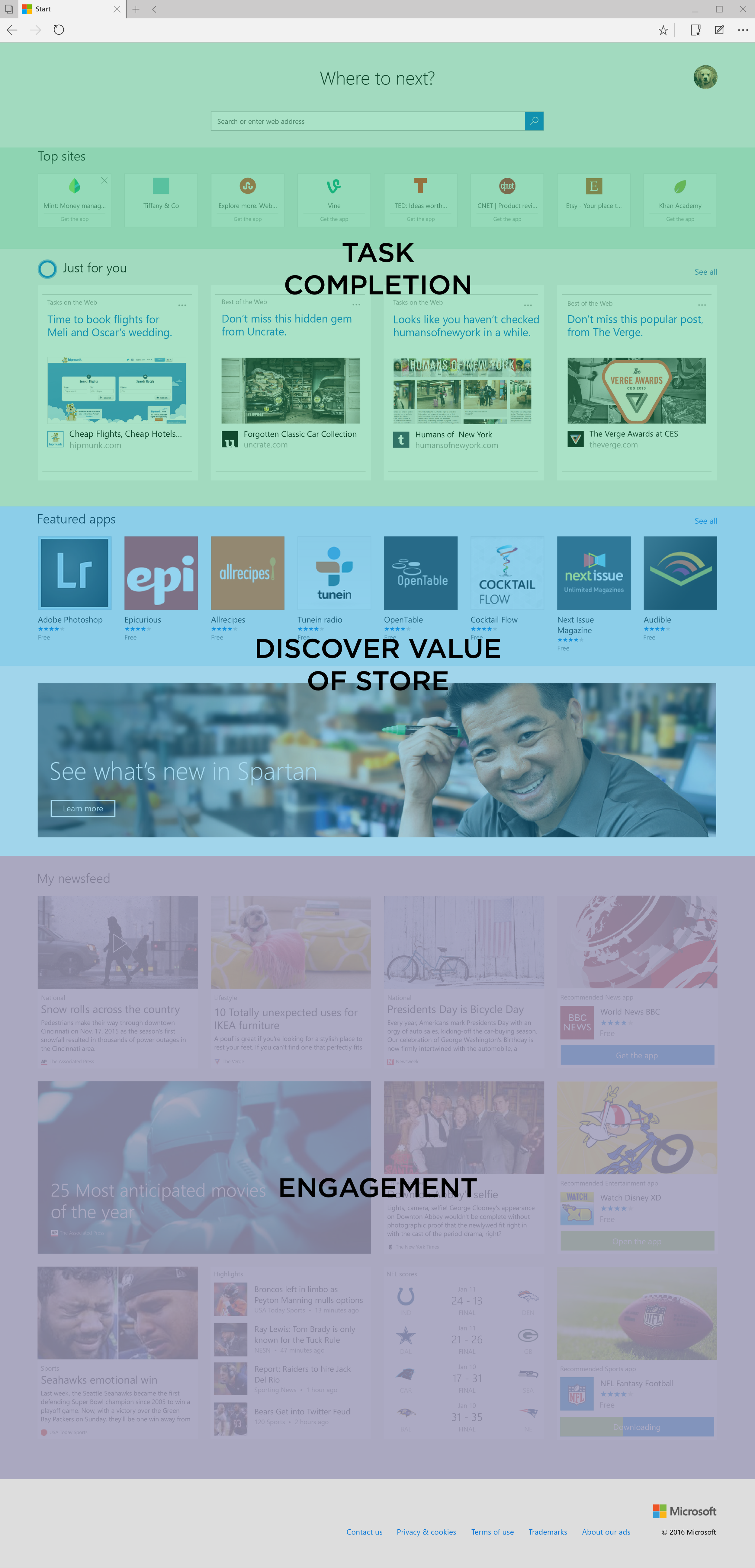
Customer value
Users can complete 3 areas of activities on Edge Homepage
Top sites: A closer look
One Top sites item contains 3 actions:
1 Dismiss X to view more recommended sites
2 Direct to website
3 Redirect to Microsoft.com Store to view the available Windows 10 app
Original design
The marketing team requested including screenshots that linked to a website, as well as additional links to redirect to the Windows 10 app
New design
The design team recommended a simpler design that performed the same actions


