My Kid's Dentist
Drawing App
The overall brand concept for My Kid's Dentist is to show they provide personalized care in an inviting and fun environment.
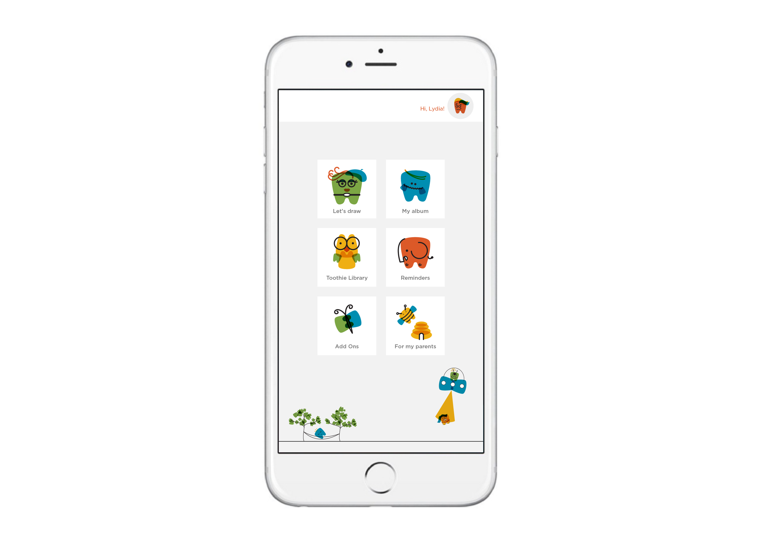
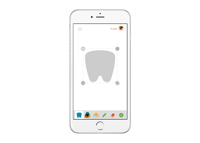
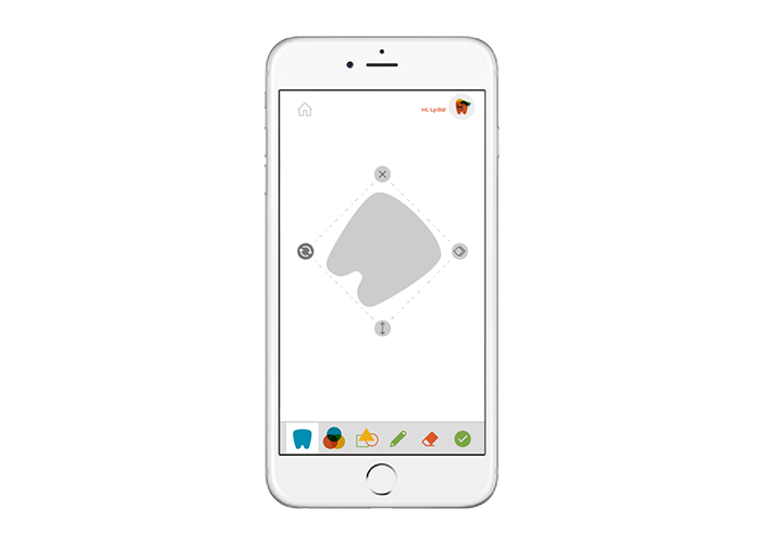
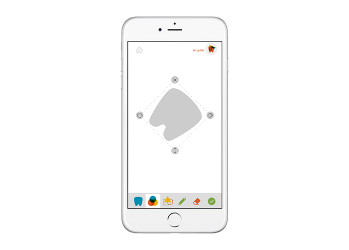
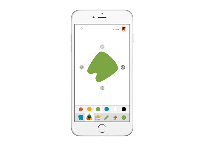
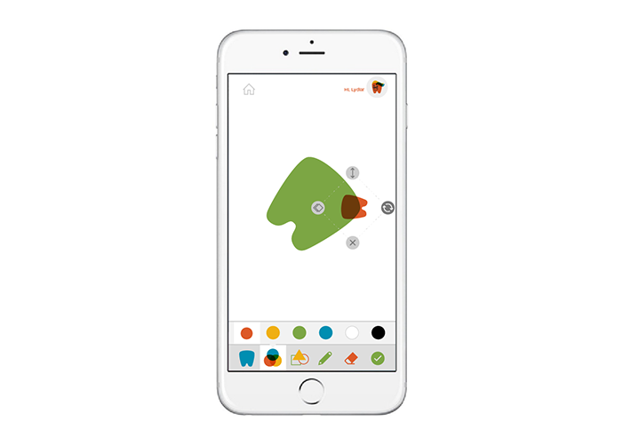
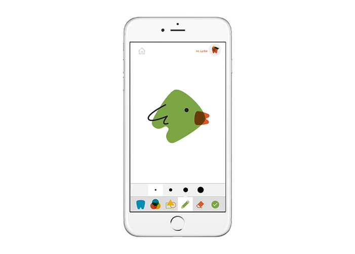
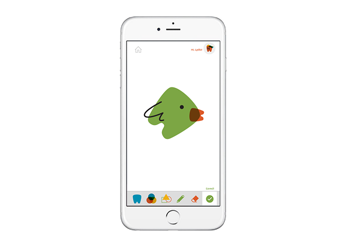
After the completion of the My Kid's Dentist customer experience for environments and brand identity system, I decided to create an extension of the experience by designing a mobile drawing app that kids could use at home or while in the office. This way, kids could continuously connect with their dentists beyond the 2 regular checkups per year.
ROLE
This was a solo project I did for fun after the completion of the initial My Kid's Dentist customer experience for environments and brand identity system.
CHALLENGE
Kids often do not look forward to going to the dentist. With this app, kids can focus on the fun and interactive aspect of their experience visiting My Kid's Dentist.
CONCEPT
As kids can draw on the interactive touch glass wall, kids can draw tooth characters and save their creations to be accessed online or at the My Kid's office.
When they arrive for their appointment, they will see their illustrations have been displayed on the interactive wall to welcome them to their dental visit.
Check out the My Kid's Dentist environments and brand identity project!
Scenario 1
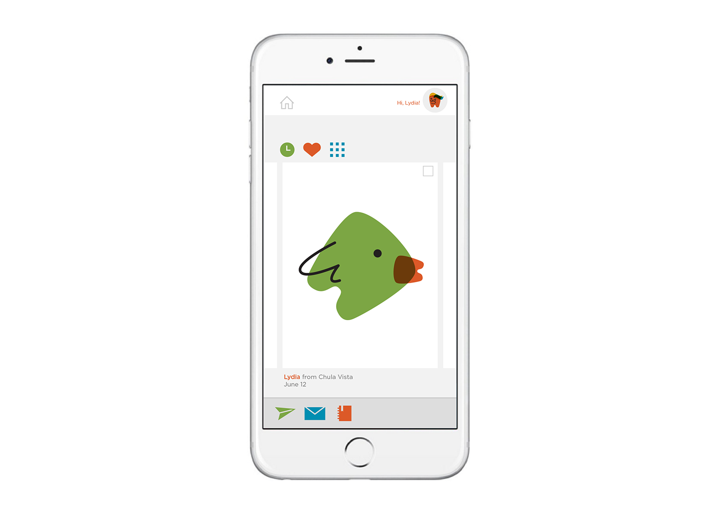
Lydia, 10 years old, has an upcoming dentist appointment in her town of Chula Vista. Her big sister Tina lets Lydia borrow her phone so she can play with the My Kid's Dentist app. She loves drawing a little toothie and seeing it on the wall when she arrives. Lydia can't wait to draw one so she can share it with Dr. Chen, her dentist.
Scenario 2
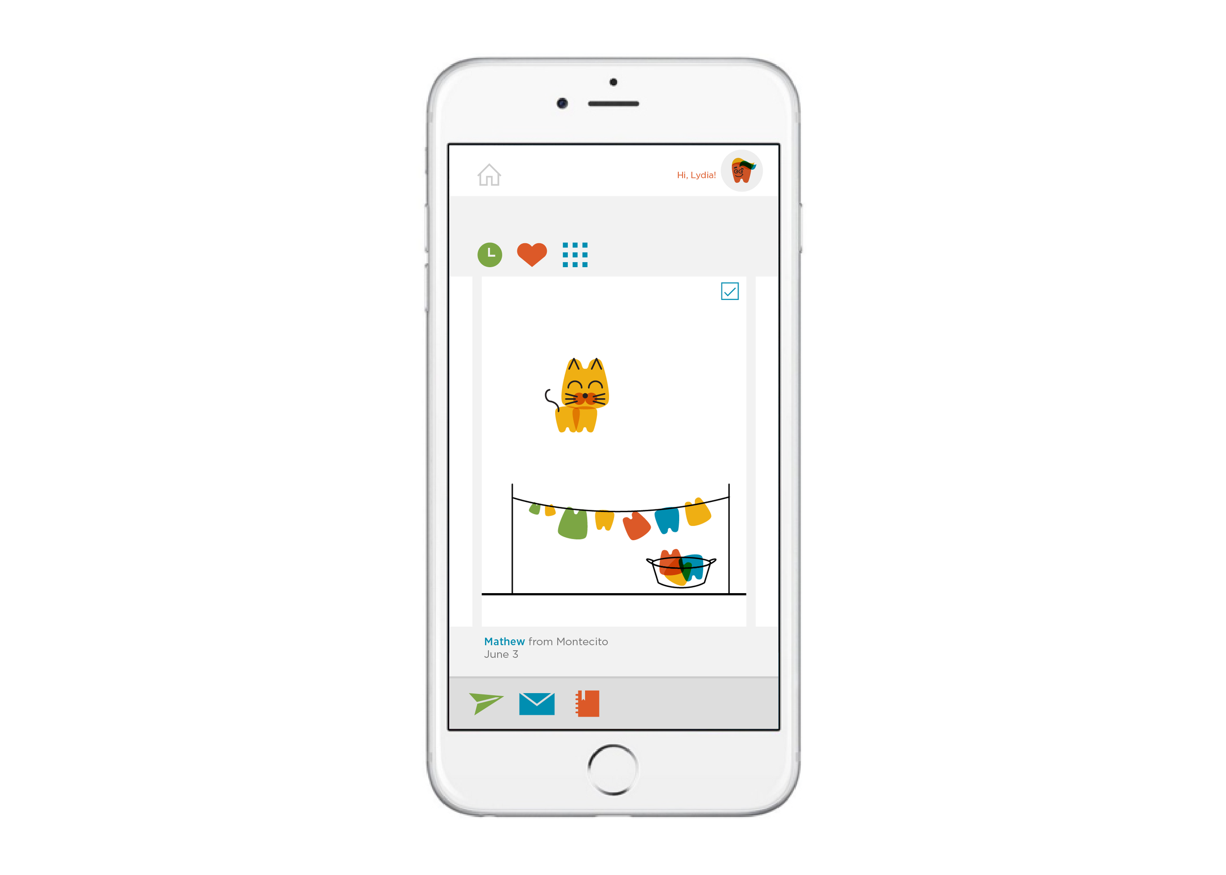
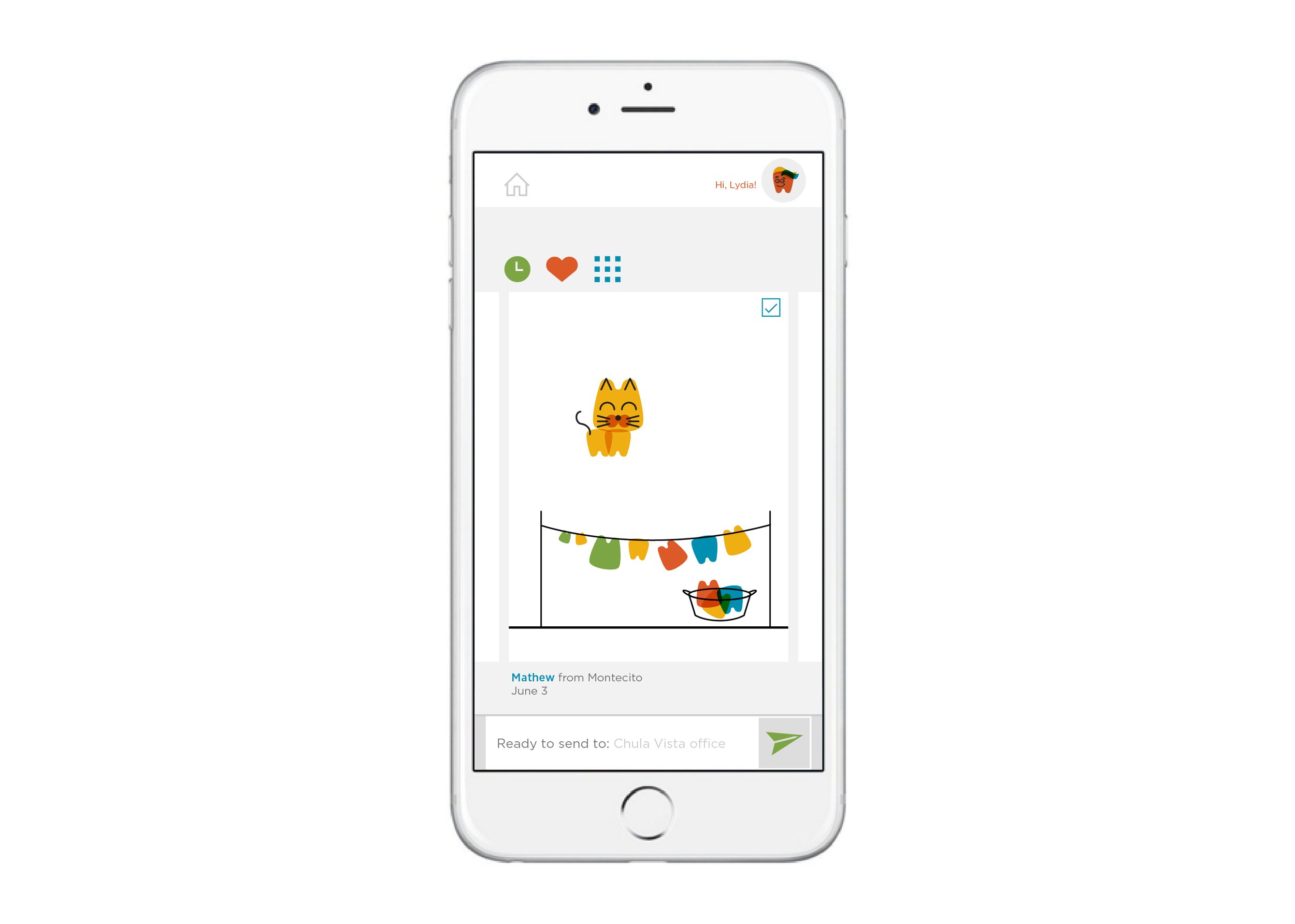
After Lydia draws a cute bird, she looks through the Toothie Library to see what other patients have drawn. She loves the one Mathew had drawn! She sends it to Dr. Chen so that she can see it on the wall on the day of her appointment.
